React Material Tailwind - Beginners’ Guide and Free Sample
This article is a comprehensive introduction to Material Tailwind, an open-source UI library for React - Free Sample is also provided (Landing Page, Auth Pages).
Hello! This article aims to help developers to accommodate Material Tailwind, a popular UI library for React actively supported by Creative-Tim. Those interested in this topic will learn how to set up the library, and how to build a simple landing page, plus signIN, and signOUT pages. The sources of this coding experiment can be found on GitHub, under the MIT license, and can be used or incorporated in commercial projects or eLearning activities. Thank you!
- 👉 React Material Tailwind - LIVE Demo
- 👉 React Material Tailwind - the official page
✨ What is Material Tailwind
Material Tailwind is a free and open-source UI library inspired by Material Design that provides a unique experience for developers working with React and Tailwind CSS. It is a highly customizable component library that provides a great user experience, thus enabling you to build stunning and responsive web applications.

This open-source library tries to combine a popular design concept with the trendies CSS Framework nowadays. Before starting to write the code, let's say highlight the key points of the Material Tailwind tool.
✅ Free and open-source
Material Tailwind is a free and open-source UI components library; this means that the code is readily available for everyone to modify and improve. Whether you are a developer or a user, you can contribute to the code or the library's documentation.
✅ Easy to use
Material Tailwind is easy to use and integrate into React and HTML projects. You don't have to spend much time learning how to use its web components. If you are familiar with Tailwind CSS, working with Material Tailwind will be a breeze.
✅ Fully customizable
The components provided by Material Tailwind are fully customizable, giving developers total control over the layout of their applications. Material Tailwind is a flexible UI library that enables you to design any UI layout according to your requirement.
✅ Excellent documentation
Material Tailwind has excellent documentation, making it easy for new and existing users to set up and learn about its components quickly. The documentation explains how each UI component works with detailed code samples.
✨ How to Set UP
Material Tailwind works perfectly with HTML and React projects. In this section, I will guide you through setting up Material Tailwind using React.
Create your React app by running the code below.
$ npx create-react-app my-project
$ cd my-project
Install Tailwind CSS and its peer dependencies via npm, and run the commands below to generate both `tailwind.config.js` and `postcss.config.js`.
$ npm install -D tailwindcss postcss autoprefixer
$ npx tailwindcss init -p
Install Material Tailwind to your React app.
$ npm i @material-tailwind/reactWrap your Tailwind CSS configurations with the `withMT()` function within the `tailwind.config.js` file.
const withMT = require("@material-tailwind/react/utils/withMT");

module.exports = withMT({
   content: ["./src/**/*.{js,jsx,ts,tsx}"],
   theme: {
       extend: {},
   },
   plugins: [],
});
Add the following Tailwind CSS directives to your `./src/index.css file`.
@tailwind base;
@tailwind components;
@tailwind utilities;
Wrap the entire application with `ThemeProvider` from Material Tailwind. `ThemeProvider` enables us to use the default styles provided by Material Tailwind.
import React from "react";
import ReactDOM from "react-dom/client";
import App from "./App";
import "./index.css";

import { ThemeProvider } from "@material-tailwind/react";

const root = ReactDOM.createRoot(document.getElementById("root"));

root.render(
   <React.StrictMode>
       <ThemeProvider>
           <App />
       </ThemeProvider>
   </React.StrictMode>
);
Congratulations!🥂 You've successfully added Material Tailwind to your React application. In the remaining sections, I will guide you through creating a landing page and an authentication page with Material Tailwind.
✨ Code a Landing Page
In this section, you'll learn how to build a landing page with Material Tailwind.
Install React Router - a JavaScript library that enables us to navigate between pages in a React application.
$ npm install react-router-domCreate a pages folder within the `src` folder containing the components for the `Login`, `Home`, and `Register` routes.
mkdir pages
cd pages
touch Home.js Login.js Register.js
Copy the code below into the `App.js` file. The code snippet below uses React Router v6 for navigating between the web pages.
import React from "react";
import { BrowserRouter, Routes, Route } from "react-router-dom";
import Home from "./pages/Home";
import Login from "./pages/Login";
import Register from "./pages/Register";

function App() {
   return (
       <BrowserRouter>
           <Routes>
               <Route path='/' element={<Home />} />
               <Route path='/login' element={<Login />} />
               <Route path='/register' element={<Register />} />
           </Routes>
       </BrowserRouter>
   );
}

export default App;
Update the `Home.js` file to contain the code below.
import React from "react";
import Nav from "../components/Nav";
import Hero from "../components/Hero";
import FirstSection from "../components/FirstSection";
import SecondSection from "../components/SecondSection";
import Footer from "../components/Footer";
import Testimonial from "../components/Testimonial";
import Faq from "../components/Faq";

const Home = () => {
   return (
       <div>
           <Nav />
           <Hero />
           <FirstSection />
           <SecondSection />
           <Testimonial />
           <Faq />
           <Footer />
       </div>
   );
};

export default Home;
From the code snippet above, Home is divided into seven sub-components. Next, create a components folder containing the sub-components.
mkdir components
cd components
touch Nav.js Hero.js FirstSection.js SecondSection.js Testimonial.js Faq.js Footer.js
✅ Coding the NAV Component
Copy the code below into the `Nav.js` file.
import { Typography } from "@material-tailwind/react";
import React from "react";
import { Link } from "react-router-dom";

const Nav = () => {
   return (
       <>
           <nav className='h-[10vh] flex flex-row ...(truncated)'>
               <div className='flex flex-row items-center'>
                   <Typography className='font-bold text-lg font-poppins text-purple-600'>
                       Meetup
                   </Typography>
               </div>

               <div className='flex flex-row items-center space-x-2'>
                   <Link
                       to='/login'
                       className='font-poppins text-white ...(truncated)'
                   >
                       Login
                   </Link>
                   <Link
                       to='/register'
                       className='font-poppins text-gray-600 ...(truncated)'
                   >
                       Register
                   </Link>
               </div>
           </nav>
       </>
   );
};

export default Nav;
From the code snippet above, `Typography` is the component provided by Material Tailwind for displaying texts on web pages. The font size of the text can be increased or reduced using Tailwind CSS.

✅ Coding the HERO Component
Copy the code below into the `Hero.js` file.
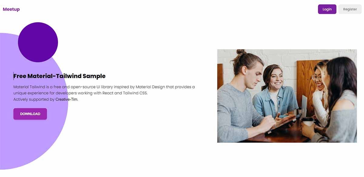
import { Button, Typography } from "@material-tailwind/react";
import React from "react";

import hero from "../images/meetup.jpg";

const Hero = () => {
   return (
       <div className='w-full lg:p-8 px-4 flex ...(truncated)'>
           <div className='lg:w-[60%] w-full lg:px-6 lg:pr-14'>
               <Typography className='text-3xl ...(truncated)'>
                   Create a great circle of friends
               </Typography>
               <Typography className='font-poppins mb-6'>
                   Lorem ipsum dolor sit amet, consectetur adipiscing elit.
               </Typography>
               <Button size='lg' color='purple'>
                   Get Connected
               </Button>
           </div>
           <div className='lg:w-[40%] w-full lg:block hidden '>
               <img src={hero} alt='Hero' />
           </div>
       </div>
   );
};

export default Hero;
Material Tailwind also provides a Button component that accepts various props; you can find them here.

✅ Coding the Info Component
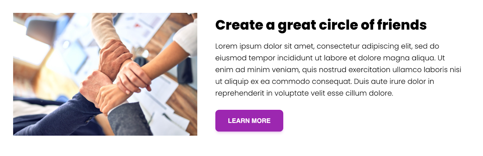
Copy the code below into the `FirstSection.js` file.
import { Typography, Button } from "@material-tailwind/react";
import React from "react";
import connect from "../images/connect.jpg";

const FirstSection = () => {
   return (
       <div className='w-full lg:p-8 p-4 flex items-center justify-between'>
           <div className='lg:w-[40%] w-full lg:block hidden '>
               <img src={connect} alt='Hero' />
           </div>
           <div className='lg:w-[60%] w-full lg:px-6 lg:pl-10'>
               <Typography className='text-3xl ...(truncated)'>
                   Create a great circle of friends
               </Typography>
               <Typography className='font-poppins mb-6'>
                   Lorem ipsum dolor sit amet, Duis aute irure dolor in
                   reprehenderit in voluptate velit esse cillum dolore.
               </Typography>
               <Button size='lg' color='purple'>
                   learn more
               </Button>
           </div>
       </div>
   );
};

export default FirstSection;
Here is the result:
In the same way, other components with different topologies are coded:
✅ Features Component

✅ Testimonial Component

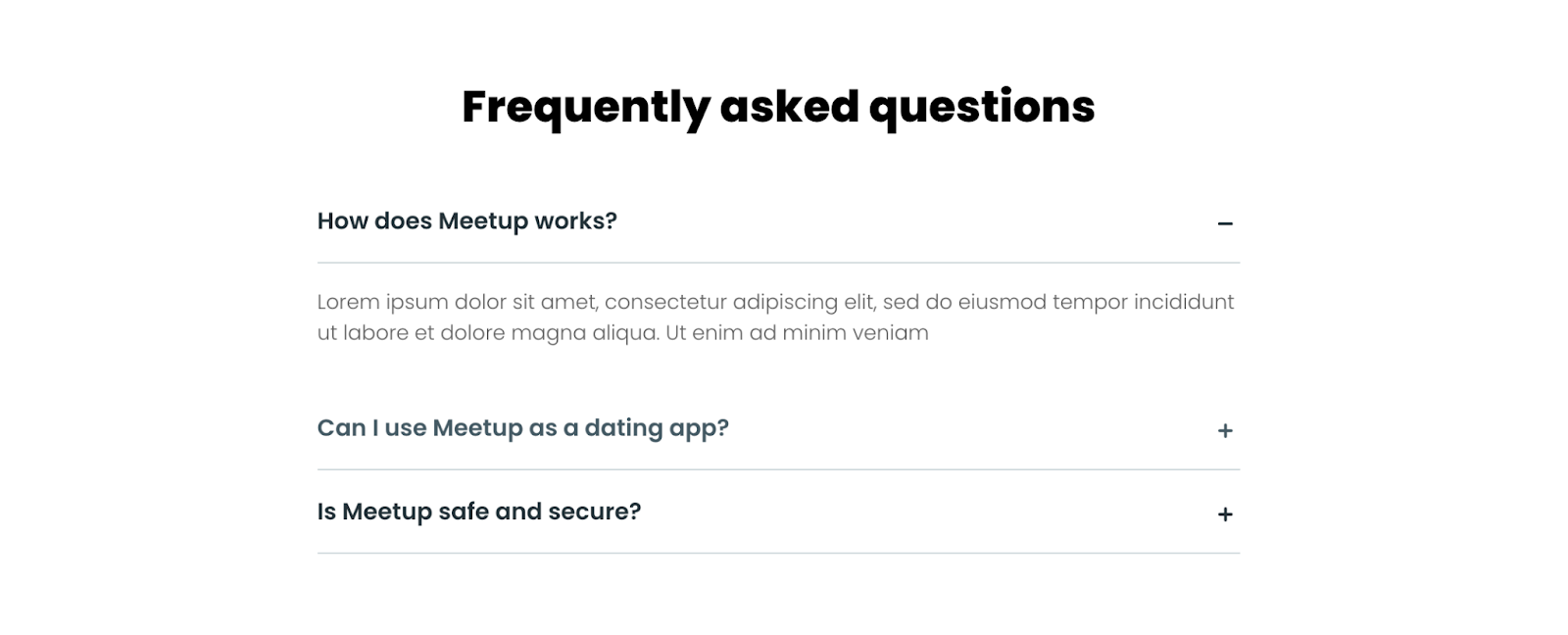
✅ FAQs Component
✅ Coding the Footer Component
Copy the code below into the `Footer.js` file.
import { Button, Typography } from "@material-tailwind/react";
import React from "react";
import Icons from "../icons";

const Footer = () => {
   return (
       <footer className='w-full footer py-12 pt-24  px-8'>
           <div className='flex flex-col justify-between items-center border-b-[1px] md:px-12 pb-8 border-b-purple-200 mb-8'>
               <Typography className='font-poppins text-2xl font-semibold text-white mb-8'>
                   Do you want to know more or just have any questions? write to us.
               </Typography>
               <Button size='lg' color='red' className='text-white'>
                   Contact Us
               </Button>
           </div>
           <div className='w-full flex items-center flex-col justify-center'>
               <Typography className='font-poppins text-lg font-semibold text-purple-100'>
                   Meetup
               </Typography>
               <Icons />
           </div>
       </footer>
   );
};

export default Footer;

✨ Code the Authentication Pages
The pages are pretty simple with a classic layout the centered elements.
✅ Coding the SignIN Page
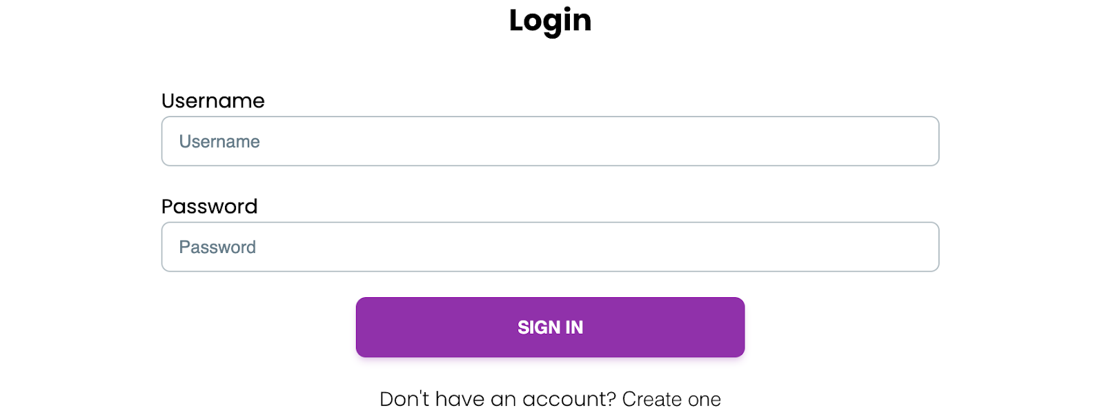
The Login component should be updated to accept a username and password from a user.
import { Button, Input, Typography } from "@material-tailwind/react";
import React from "react";
import { Link } from "react-router-dom";

const Login = () => {
   return (
       <form className='w-full min-h-[100vh] flex flex-col items-center justify-center space-y-5 md:px-auto px-6'>
           <Typography className='text-2xl font-bold font-poppins mb-4'>
               Login
           </Typography>

           <div className='md:w-[70%] w-full'>
               <label className='font-poppins'>Username</label>
               <Input label='Username' className='font-poppins' />
           </div>
           <div className='md:w-[70%] w-full'>
               <label className='font-poppins'>Password</label>
               <Input label='Password' type='password' className='font-poppins' />
           </div>
           <div className='md:w-[70%] w-full flex items-center justify-center'>
               <Button size='lg' color='purple' className='w-[50%]'>
                   Sign In
               </Button>
           </div>
           <Typography className='font-poppins'>
               Don't have an account?{" "}
               <Link to='/register' className='hover:text-purple-400'>
                   Create one
               </Link>
           </Typography>
       </form>
   );
};

export default Login;
Material Tailwind provides an Input component that allows you to accept users' data via forms. The Input component supports different props for various types of data.
The registration page is quite similar to the signIN and the code can be found on GitHub.
Congratulations! You've completed the project for this article.
✨ Conclusion
So far, you've learned the following:
- ✅ What Material Tailwind is,
- ✅ Why you should use Material Tailwind,
- ✅ How to set up Material Tailwind in a React application
- ✅ How to build a landing page with Material Tailwind, and
- ✅ How to build a login and register route with Material Tailwind.
Material Tailwind provides a faster way of building stunning and user-friendly web applications. It is free and open-source, so you are welcome to engage with the community as a developer or contributor.
This tutorial explains a few UI components provided by Material Tailwind. You can also explore the documentation and the GitHub repository for other features that it offers.